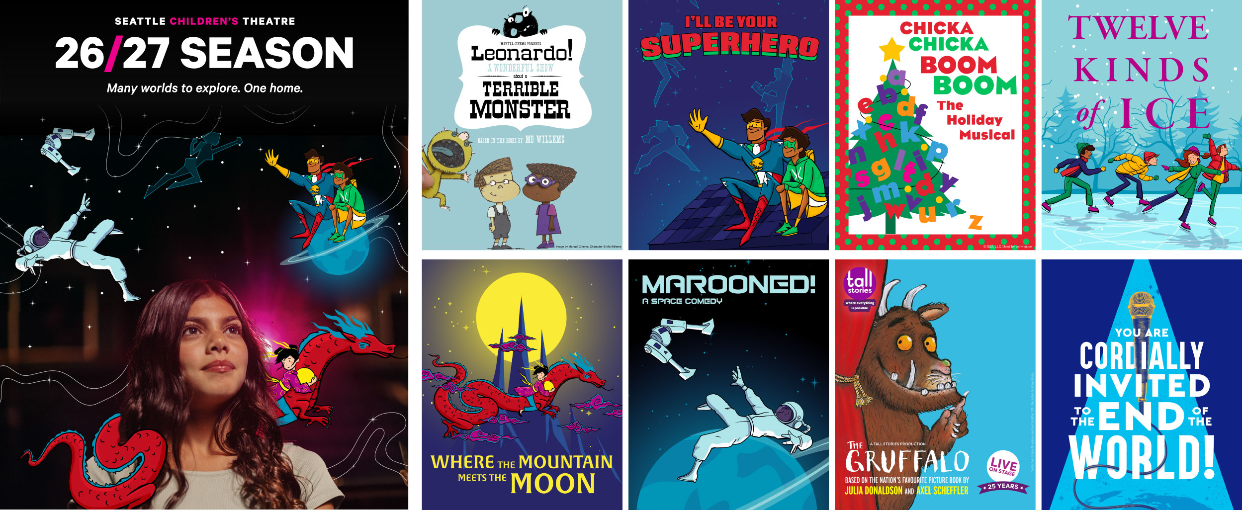
Each spring, Seattle Children’s Theatre announces its productions for the coming year. I created a visual identity for the 26/27 Season Launch across web, motion graphics, email, social, and print. Designer Olivia Mangione created incredible illustrations for each show that I used to create key imagery for the launch.
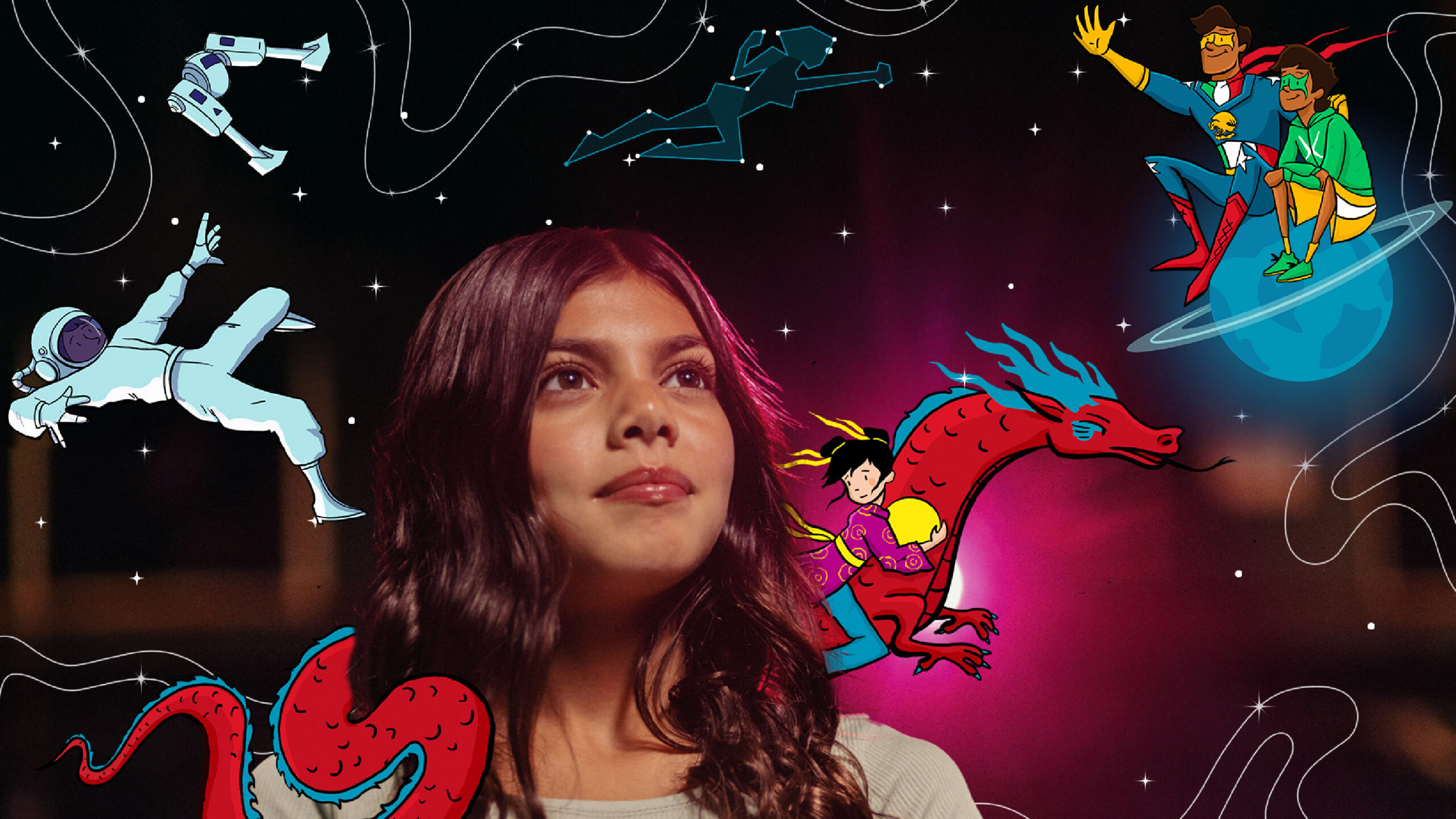
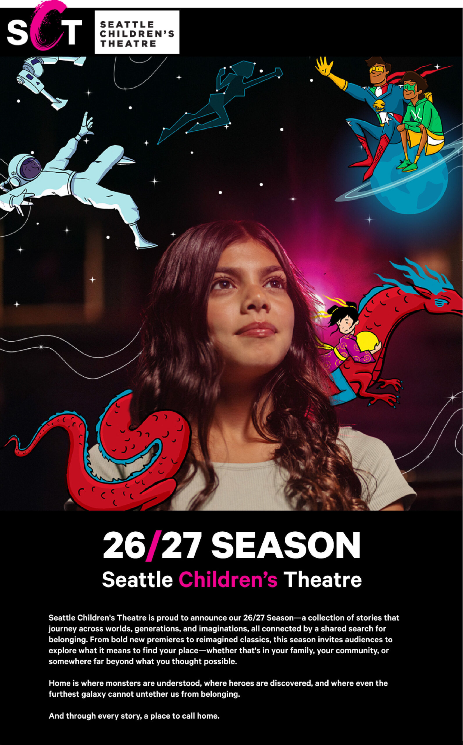
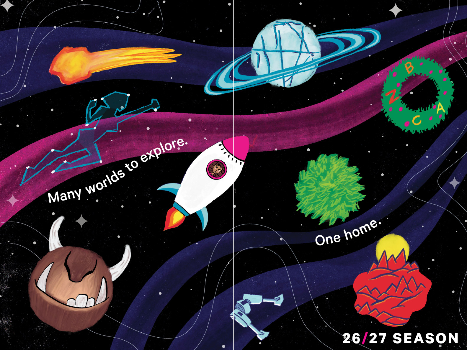
The 26/27 Season's tagline is 'Many worlds to explore. One home.' The show illustrations include several scenes set in the night sky, surrounded by stars. Therefore, I chose the key cover image for the season to include a young girl gazing into the beyond, as several characters from the various shows float around her in space. It represents how even in a vast universe (or a season with a variety of different productions), all is connected.
I started by designing a carousel to introduce the season, with the key art as the cover and one slide for each show.
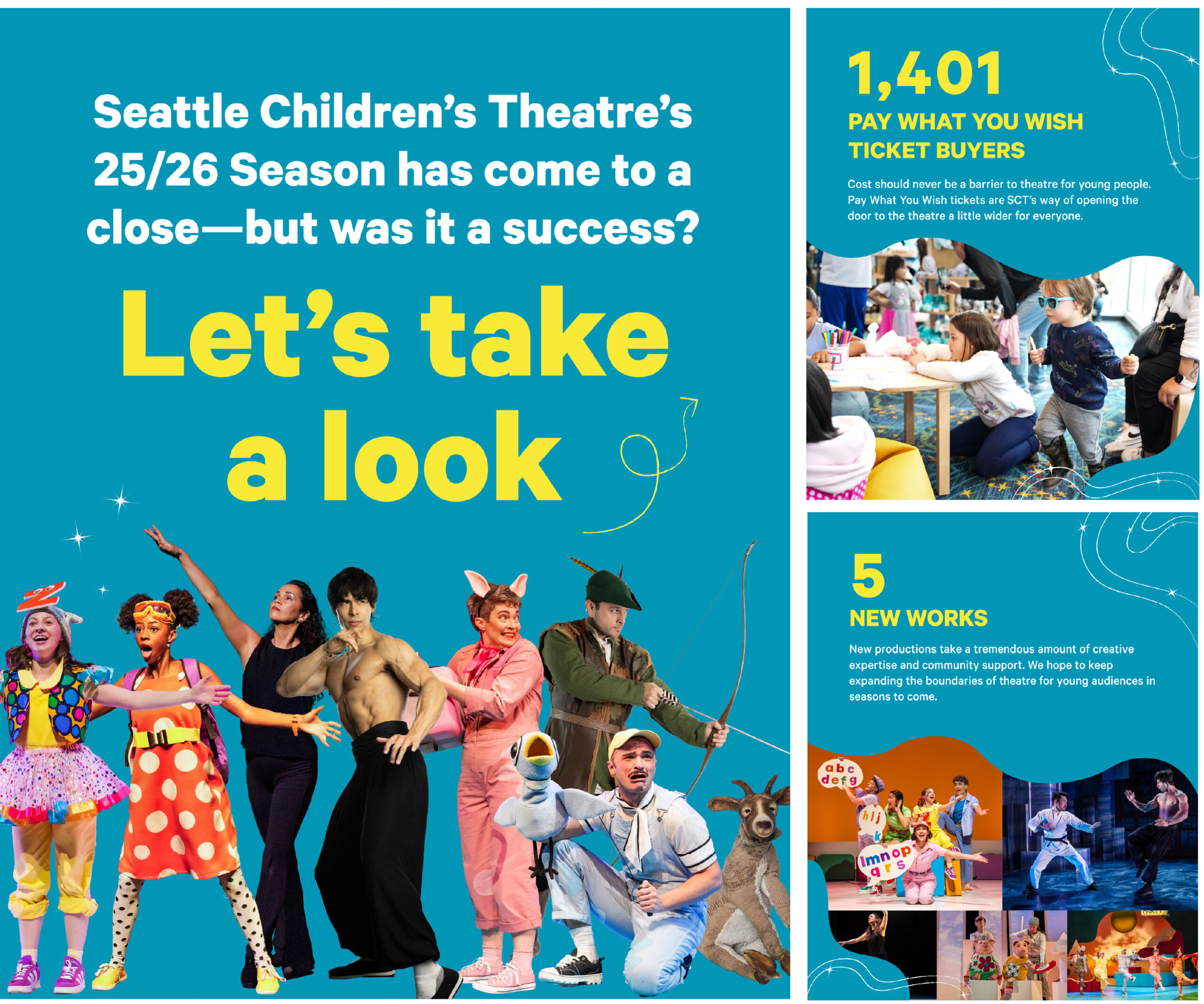
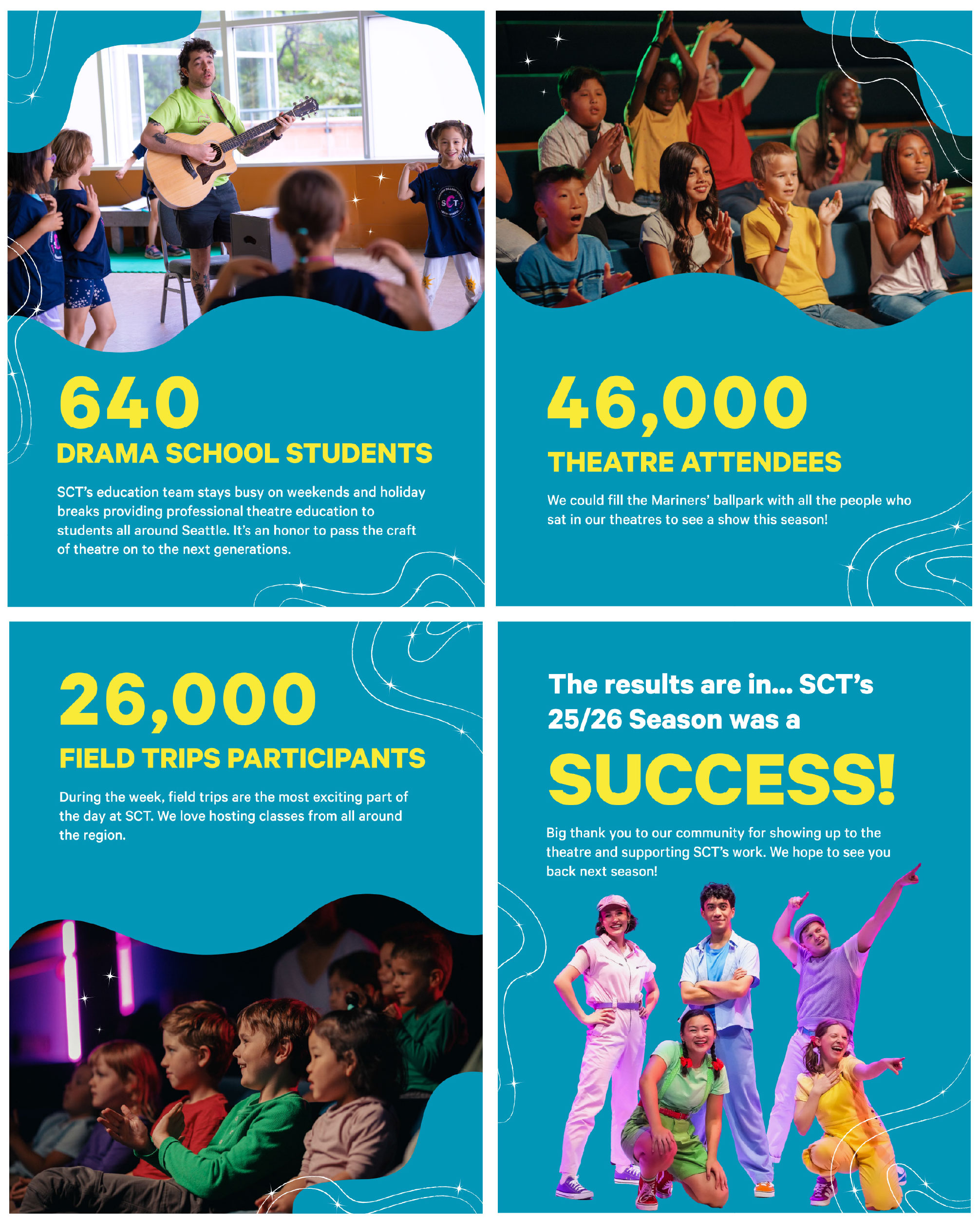
Closing carousel on 25/26 Season — Saying good-bye to the previous season and highlight its successes.
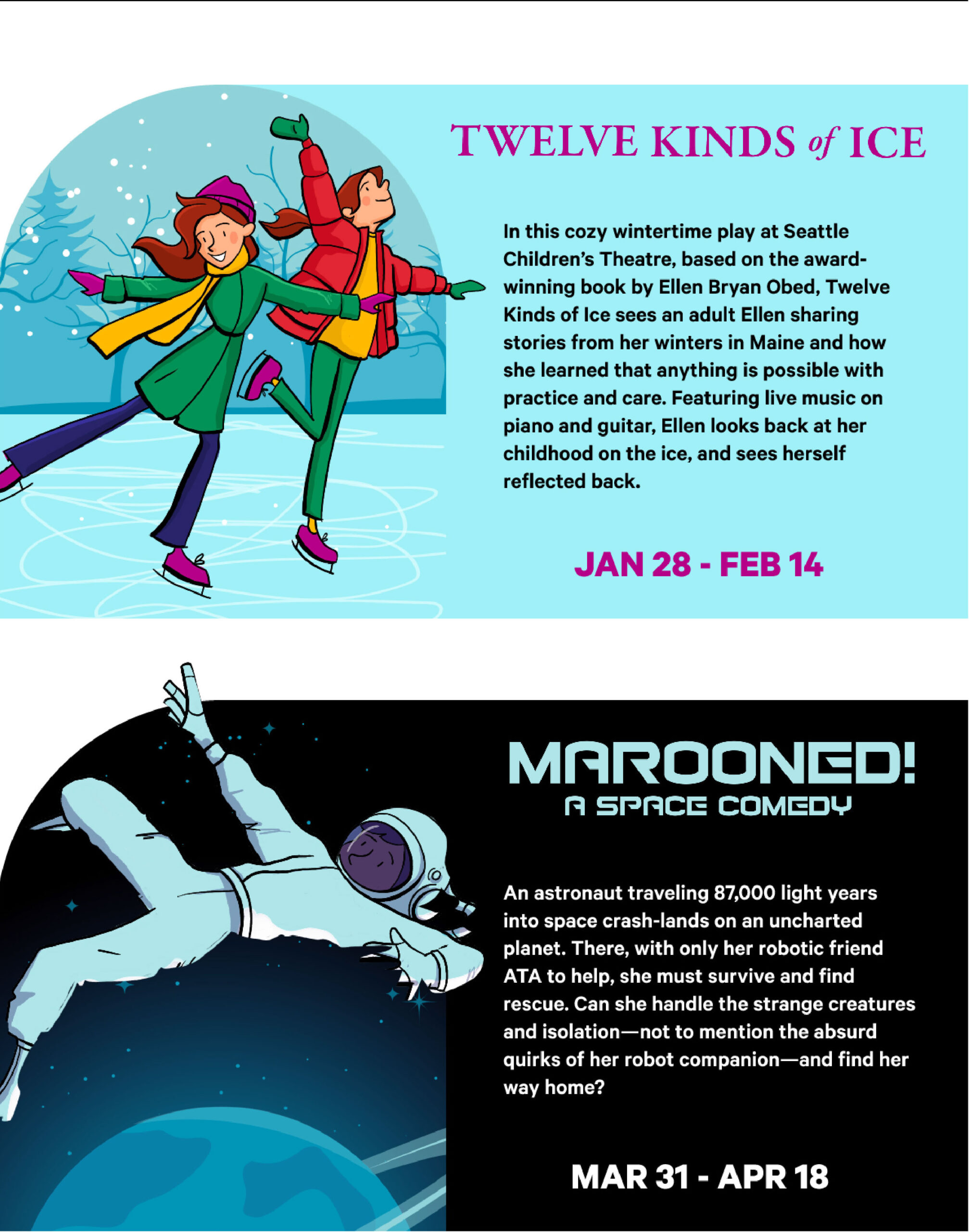
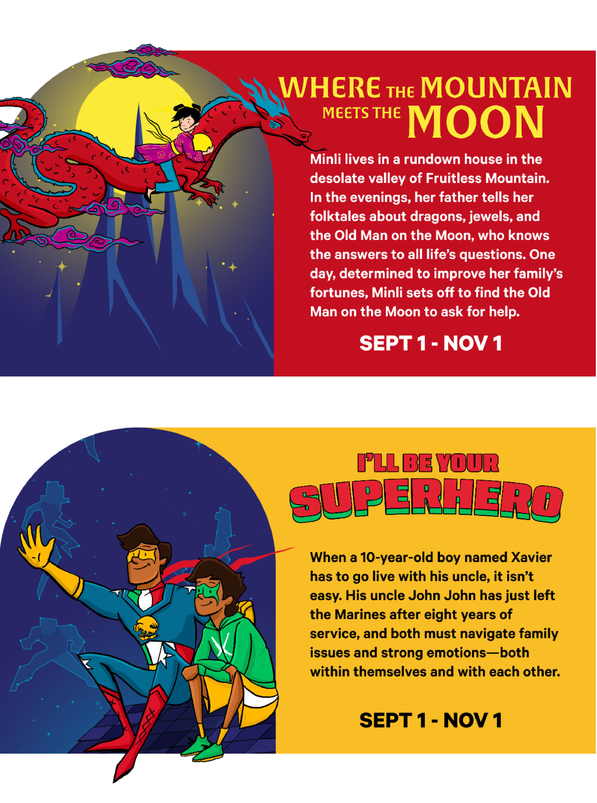
Season launch email sample — I chose the arch shape as a frame for the the shows' illustrations because it's often used within SCT's brand to represent portals and doorways. Each piece of illustration has the characters subtly break free of this containing shape, hinting at freedom and possibility.
Decorative illustration for printed brochure — I played with the visual theme of outer space by creating a unique 'space object' for every show, all part of a universe being explored by a rocketship with a child inside.
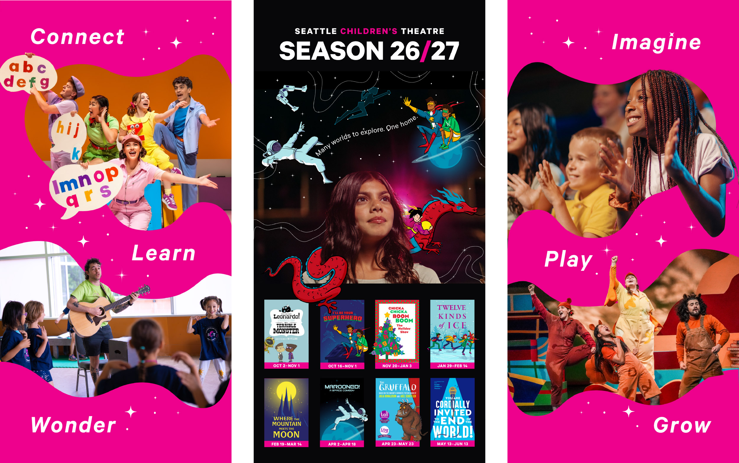
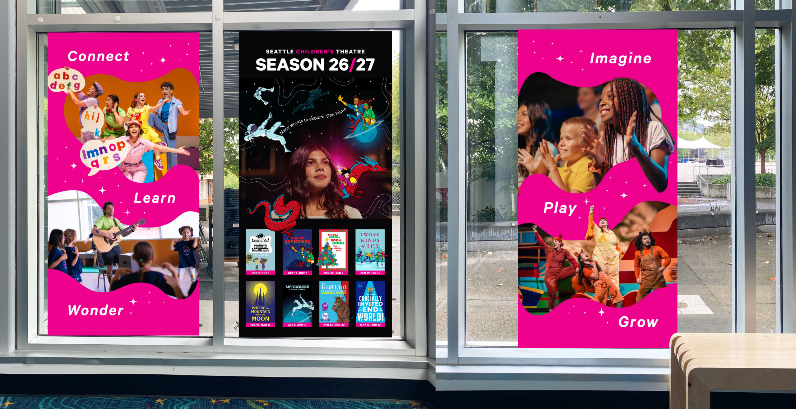
72" banners to hang in lobby windows — The banners are double-sided, so I created one design for an audience of external passerbyers and another to face the inside of the lobby, for an audience of our patrons and guests. My goal was to bring awareness to SCT's general programming and to the new season. I continued to play with the visual motifs of outter space, breaking the frame of containing shapes, and a smattering of sparkles and stars.
The following three banners face externally. The first banner faces a major walkway and the other two are located directly around the corner.
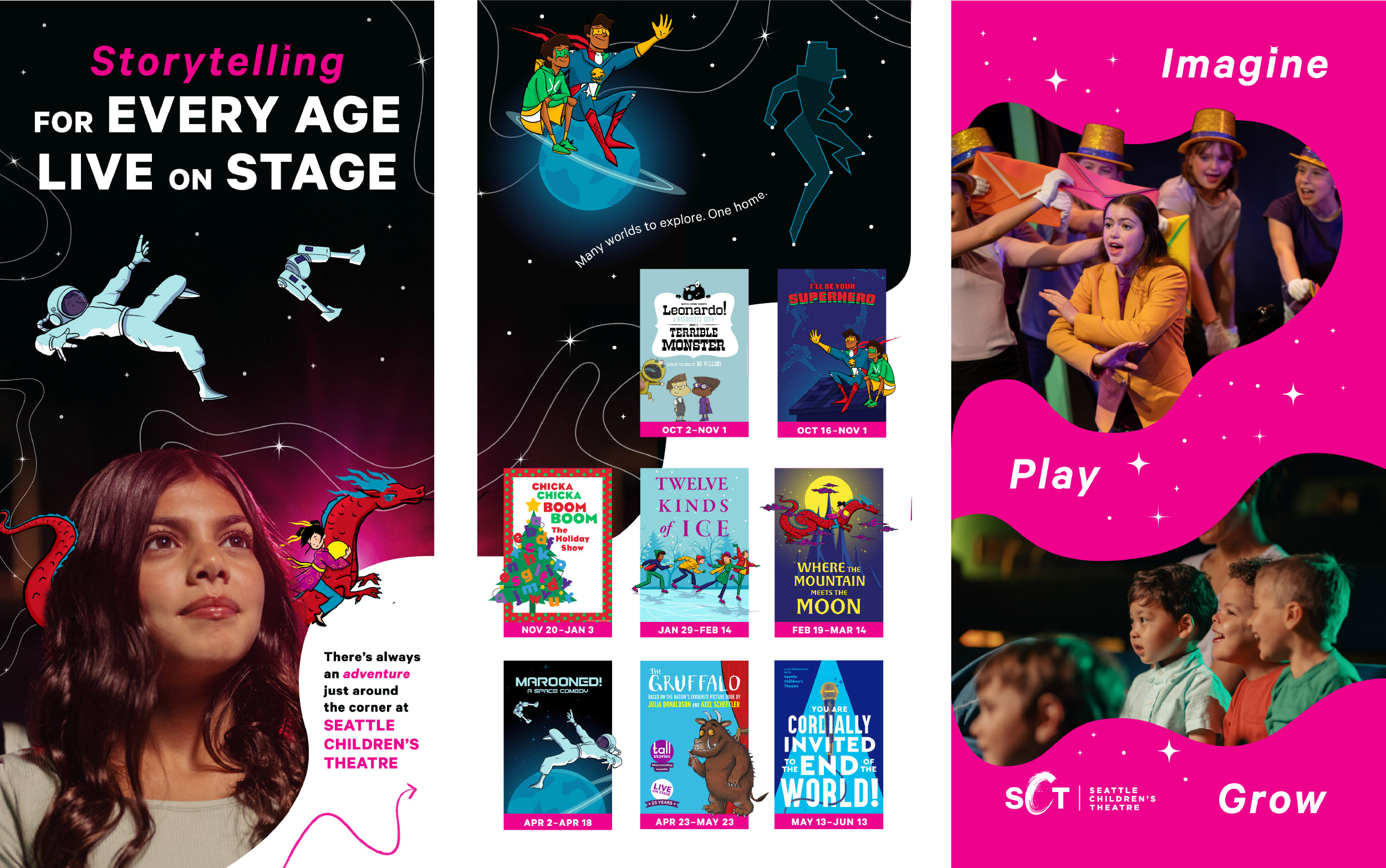
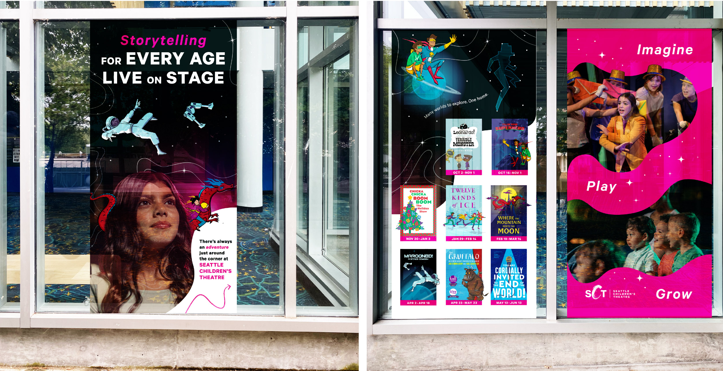
The following three banners face the inside of the lobby.
Finally, I animated Olivia Mangione's show illustrations, to be used for digital ads, email, socials, and lobby screens.
Selected Works