Packaging and branding redesign for the company R+CO, specializing in natural hair care. R+CO’s packaging needs to do more than stand out on the shelf or bath tub. It should reassure and inform users of the products’ value: an all natural option that will leave hair shiny and healthy.

The organic shapes and colors characteristic of this rebrand are intended to communicate the brand's commitment to natural, gentle ingredients. Each shampoo blend is distinguished by a unique key element, including baobab oil, teatree oil, and apple cider vinegar. The visual language is bold, bright, and expressive, unabashedly capturing attention while steering clear of typical visual tropes in feminine body care.


Selected Works

RADIALINFO DESIGN - publicity campaign

JubileeLogo Design
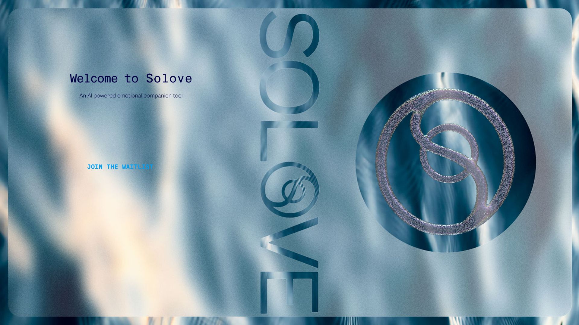
SOLOVEUX/UI, BRANDING
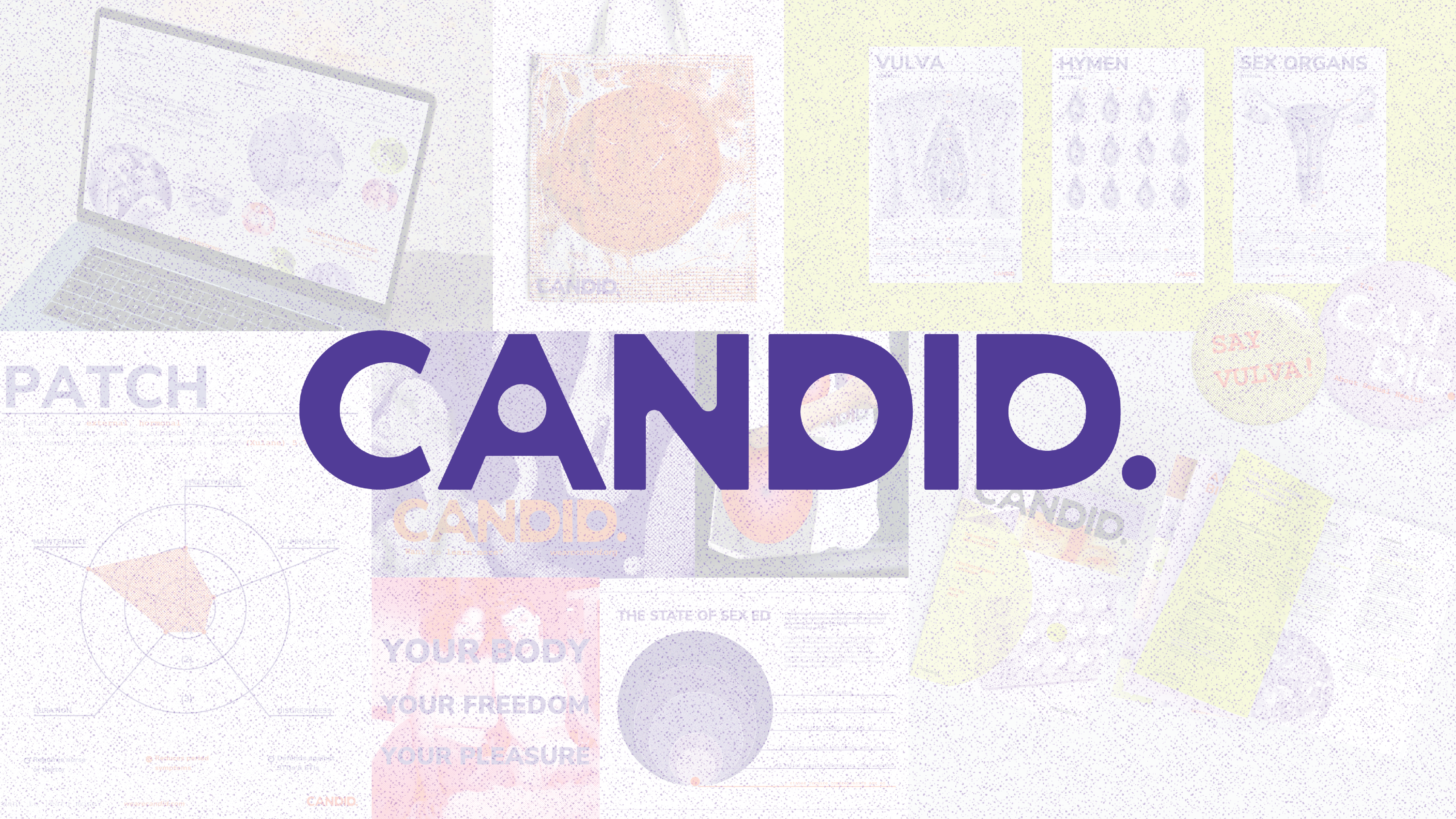
CANDID Wellness CampaignINFO DESIGN - publicity campaign
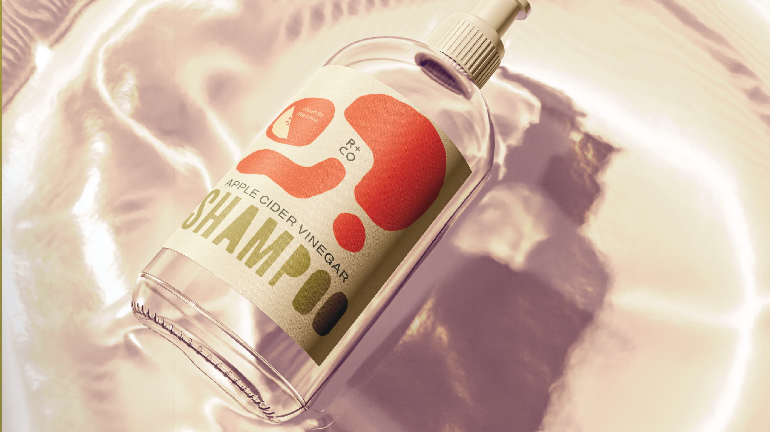
R+CO Hair CareBRANDING, PACKAGING - shampoo
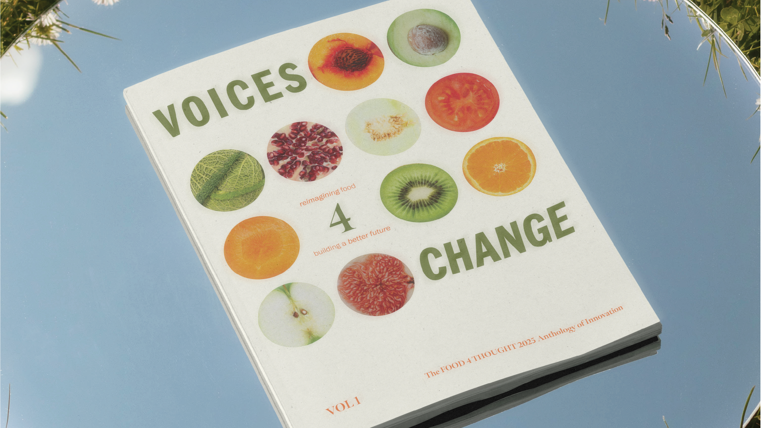
Voices 4 ChangePRINT DESIGN - magazine